Text as an Enigma
In a world saturated with information, Atypography emerges as a revolutionary art movement that redefines our interaction with text. Its core idea is to create designs where text, while fully readable, ingeniously conceals its textual nature at first glance. This approach challenges conventional typography by using non-standard fonts and experimental layouts, offering a “sensory respite” from the constant “push” of information. The “A” in “Atypography” signifies “without” or “not,” meaning text can exist without immediate, overt readability, inviting a more mindful and less intrusive form of communication. It introduces an “instinctual reading blocker,” compelling the viewer to consciously decipher the message, fostering a deeper engagement.
Atypography is the brainchild of Svethe Grudi and Milenović Nikola. Svethe Grudi is the primary author of the comprehensive User Manual and can be contacted for commercial use or creative ideas. The movement’s genesis stemmed from a personal frustration with “too loud” and “theatrical” conventional text on a music album cover, leading to playful experimentation and a deep exploration of the subconscious in design.
Kvadrug: The Typeface of Hidden Patterns [download]
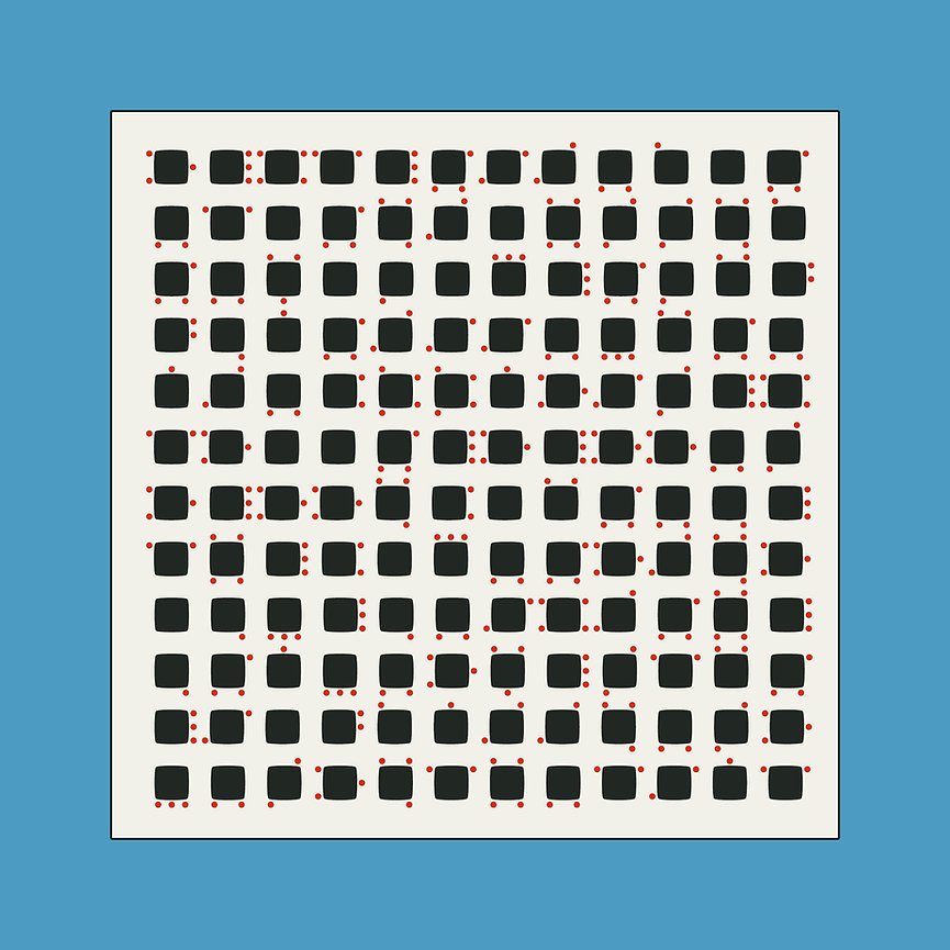
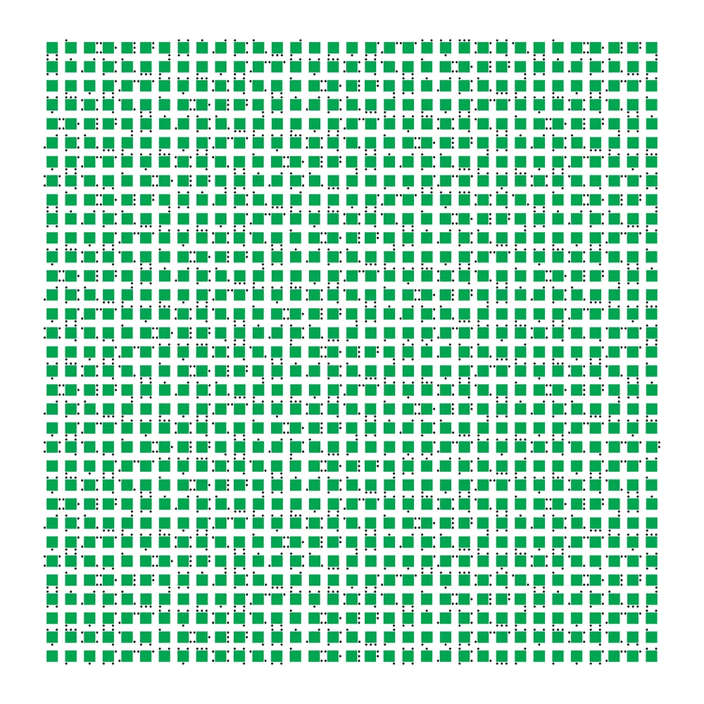
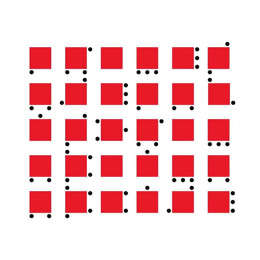
Among Atypography’s diverse font categories, Kvadrug stands out as an “Alteration Font”. Its base is a square, and its alteration elements are dots. The minimal addition of these dots to a consistent square base makes the glyphs appear as abstract forms, effectively concealing the underlying text.
The Kvadrug Xtrovert typeface was famously used by artist Nina Dolev Bugarski (known as @ninadb.4 on Instagram) to visualize a love poem. This piece captivated observers, as it wasn’t immediately recognizable as text, but rather as an abstract composition or decoration. The poem, when presented, challenged people to “crack” it, revealing how each square held a secret and how the circles around them shifted to form the “arms of letters”. This exemplifies Atypography’s ability to transform written words into a subtle yet powerful visual experience, where the text is simple enough to remain readable with effort, yet uniform enough to blend into an abstract design.
PRETVORE U MIT.
JER I KAD ŽMURIŠ ZNAŠ
DA SE DRŽIŠ ZA NIT.
ONU S DRUGOGA SVETA,
JER REČ TI JE OVA SVETA.
TREPET DANA KOJI SE RAĐA,
NA IVICI NIŠTAVILA SPASA LAĐA.
I ŽELEĆEŠ DA ZNAŠ
KAKO JE KAD KROZ TREPAVICE GLEDAŠ.
KAD DOĐE NOĆ S MEDOM I SOLJU,
PA PREBROJAVAŠ SVE TE REČI
KAO KLASJE PO POLJU.
JER VEZALE TE OČI MOJE – ZVEZDE,
█████████████████████████
███████████████████ GNEZDE.
PA OSTAO SI DA STOJIŠ,
DA GLEDAŠ U MENE
I REČI MOJE BEZVREMENE.
– Nina Dovlev Bugarski


via atypography.com